

Photography produced by ēdn


Product Introduction to a Larger Market
ēdn sits at the intersection of home design, gardening and technology. Its flagship product combined an indoor gardening system with app-supported watering and light features that allowed customers to easily grow seeds into herbs, vegetables and flowers. Importantly, ēdn understood that no matter how successful the technology and gardening results were, the product needed to be an interior design object that looked good enough to compete for the limited countertop space in people’s homes. Combo began working with ēdn as the company was preparing for its debut in Apple stores and looking to evolve the brand and create packaging that could sit next to Apple's suite of in-store products.
Across cultures and over millennia, humans have brought plants into their homes.
Strategy for Brand Update
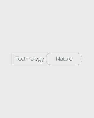
Combo strategists worked with ēdn to develop a brand strategy based on enabling people to connect to nature in new ways ©. The team sought to highlight how the innovation and technical aspects of the product facilitated a deeper connection between people and nature, in any home, during any season. In line with this approach, the aesthetic appeal of the product not only reflected a design sensibility but also stood for something larger: reframing the seeming duality of nature and technology into a new type of synergy.
A Visual System Blending Nature with Technology
To develop the visual system, the Combo design team explored the key question of how to modernize nature. Mapping out the brand’s technologically advanced expression of nature included explorations into minimal typefaces, botanical images, app design and color palettes that paired earthy and electric tones, bringing contemporary design and technology to the world of plants.
Defining a Photographic Point of View
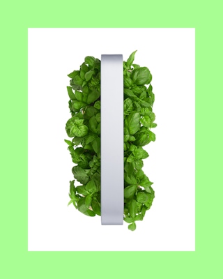
The photographic point of view took inspiration from the engineering background of ēdn’s founder. Combo designers identified the brand’s photographic perspective as crisp and minimalist, using closeups and microshots that offer a different view of what a leaf is: perfectly engineered details and seamless design. The updated brand identity would be expressed most clearly through photography that blended advanced technology and a fascination with nature.
Packaging Design for Evolved Brand Identity
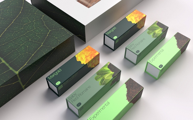
The new packaging was about creating an experience that grew with each layer. From Apple store shelves to opening the product at home to reading the instructions, each step was designed to deliver a surprise, inspired by the way seasons unfold in nature. The exterior of the box had a sleeve that was comparable to the minimal look of the Apple products it would be displayed alongside. It was annotated with product features similar to a technical diagram, and once removed, it revealed a large closeup photograph of a leaf, giving the impression of being confronted by nature. Inside the box were seed packs with closeups of the included plant and an instruction manual designed and written by Combo. The overall effect aimed to bring the customer, at every turn, another step closer to nature.
An intelligent gardening system that takes a lot of the guesswork out of gardening.
New business: Connect with a partner.
Job inquires: View our handbook.
Newsletter©: Sign up.
Combo
76 Bowery, 3rd Floor
NYC, 10013
Social Media
Instagram, LinkedIn
View our show reel:
Watch video
General inquiries:
hello@combo.co
Media inquires:
press@combo.co