

Conceiving a Next-Generation Mall
With the rise of D2C brands driving the consumer experience online, the shopping landscape was changing significantly. Taking inspiration from department stores—which, despite their decline, have an undeniable influence on business and popular culture—Showfields was created to be a physical retail space that gathered together the most interesting, in-demand digital brands. With support from Combo, Showfield’s flagship NoHo location was launched as a next-generation mall, blending unique curation and points of interest for the in-store shopper.
Brand Strategy of Surprise and Delight
Combo helped shape the Showfield brand strategy around the idea of bringing amazing and impressive things together under one roof, reminiscent of the way a circus is a house of unexpected delights. Expanding on this theme, the strategy team merged inspirations from the likes of Barnum & Bailey’s Greatest Show on Earth with the history of department stores. Showfields was positioned as a destination of surprise and delight, where visitors could shop the latest and most interesting goods, while encountering art, immersive installations and other unique experiences.
The noblest art is that of making others happy.
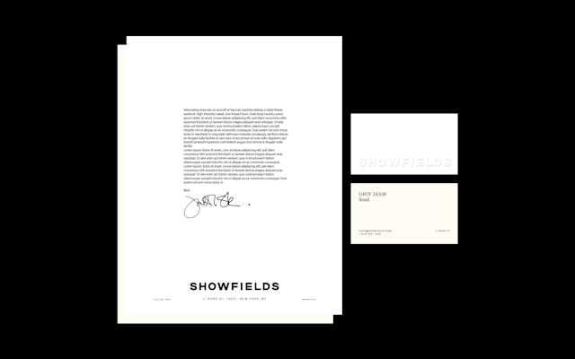
Visual Identity and Design System
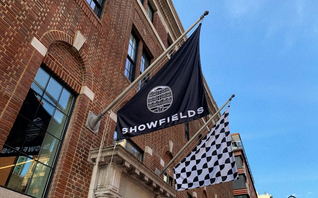
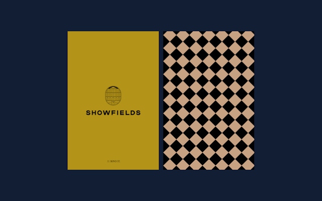
The Combo design team began the brand identity work looking at the way traditional department stores were designed as a centrally located one-stop shop. Refining the name from its earlier iteration of “Mr. Showfields,” the design approach also referenced historic gestures and modernized them. For example, from department store stamps and graphics on wrapping paper and boxes, the designers created contemporary patterns and an icon system made of doorway shapes, which tied back to the world of surprise and delight. A door was also included in the logo, signaling welcome and intrigue.
Library of Original Patterns
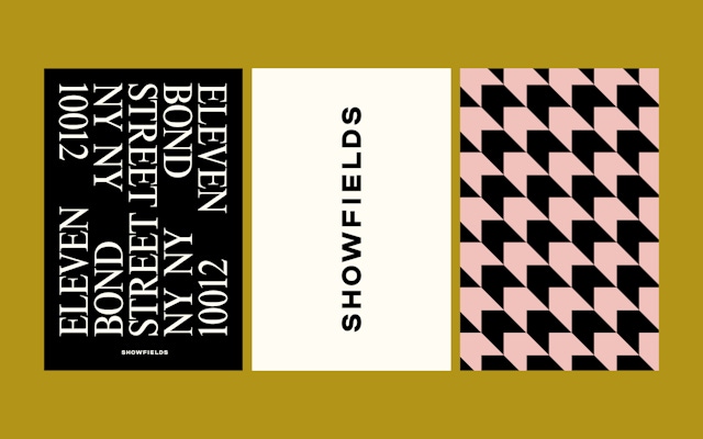
Digging even deeper into patterns, Combo designers created a library of eight original graphic treatments that reimagined classic patterns like houndstooth and pinstripes, but using bright colors for a contemporary feel. These patterns could be used anywhere from bathroom walls to the interior of shopping bags to marketing materials. The rationale here was that patterns act as reminders of old department stores and luxury fashion, and are also a bit like optical illusions. A large collection of patterns became an effective way to blend the legacy of the department store with the mystery and modernity of what the Showfields brand stands for.
Showfields is about physical retail in an increasingly digital world, and it aims to blend the best of online and offline.
New business: Connect with a partner.
Job inquires: View our handbook.
Newsletter©: Sign up.
Combo
76 Bowery, 3rd Floor
NYC, 10013
Social Media
Instagram, Behance, LinkedIn
View our show reel:
Watch video
General inquiries:
hello@combo.co
Media inquires:
press@combo.co