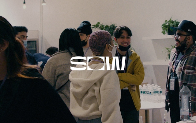
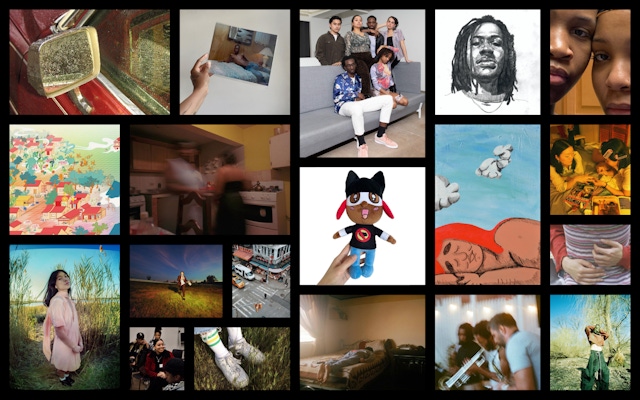
Images created by SOW members
Reflective Representation in the Creative Industry
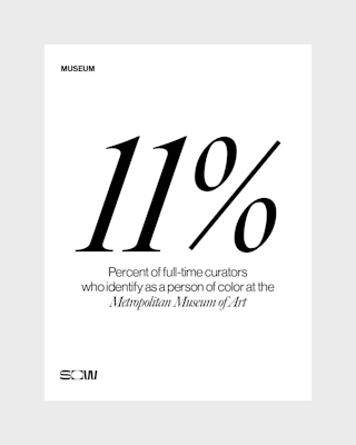
Responding to the lack of diversity in the creative industry, SOW was founded as a talent development agency for young BIPOC creatives. SOW provides its members with creative and professional opportunities such as skill-building events, a fellowship program and paid career placements through its relationships with creative companies. Combo began working with SOW as an early industry partner, and when it was time to build out the brand world, SOW’s core tenets and staffing model were key elements of the project.
Mutually Beneficial Partnership
The existing partnership with SOW helped Combo build its design group. Fellowship placements opened the door to further employment for young designers at Combo—a successful example of SOW moving toward its goal of increased equity and inclusion in the industry. After proof of concept, the mutually beneficial partnership led SOW to select Combo as the appropriate studio to bring the SOW brand to the next level.
Adopting the SOW Model
The strategy behind this project stemmed from Combo’s adoption of the SOW model for creating opportunities and career paths. A number of Combo designers had experience coming up through SOW’s talent development initiatives, which enabled Combo to build a team for this project that was led by the designers best suited to take it on. As a result, the design work that emerged truly expressed the brand identity because the designers brought their experiences with SOW to the table.
Designing the Logo
The design team created the logo with SOW’s mission in mind. Beginning with the “O,” designers conceptualized the open space of the letterform as a call for the industry to make space for BIPOC creatives. The open space was also a representation of the void in the creative sector that would be filled with the vital perspectives of young BIPOC people. Additionally, the “O” acted as a spotlight for the young people, framing images of them and their creative work. From there, the designers crafted the “S” and “W” using design principles and their aesthetic points of view.
I want to do work with people who are trying to make change, and kind of push the limits, push the boundaries, and push people of color outside of the box that we’re put in.
Creating a Visual Framework
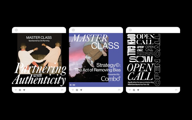
The next step was to create a visual framework that could act as a supporting device for SOW’s messaging and members’ work. Considerations included color, typography and space. Primary use of black and white, along with a straightforward and easy-to-read typeface, allowed the messaging to stand out and provided necessary balance to the often color-rich member work that spanned several mediums. Choosing an open source type ensured easy accessibility. The resulting visual framework showcased a communal—as opposed to hyperconsistent—aesthetic, genuinely made by a group of people.
For companies that say they don’t know where to find young, self-starting, highly motivated, creative people of color.
New business: Connect with a partner.
Job inquires: View our handbook.
Newsletter©: Sign up.
Combo
76 Bowery, 3rd Floor
NYC, 10013
Social Media
Instagram, LinkedIn
View our show reel:
Watch video
General inquiries:
hello@combo.co
Media inquires:
press@combo.co