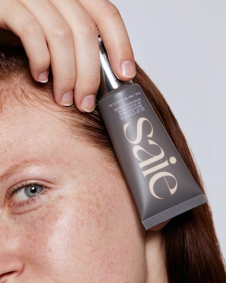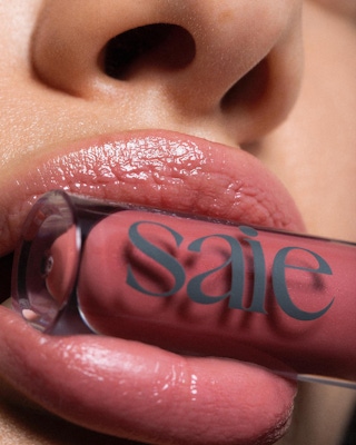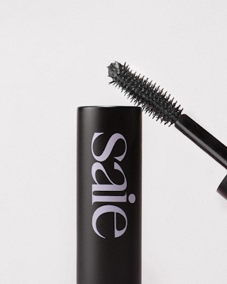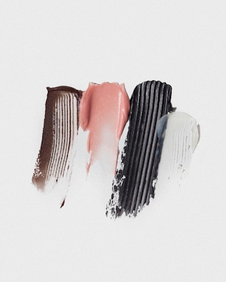


Photography produced by Saie


Rethinking Clean
Saie Beauty began with the objective of putting young women at the heart of their business. The vision was to do this by creating the cleanest products possible © while embodying the fun and playful appeal of category leaders like Glossier. Within the beauty category, competitors that shared Saie’s “clean beauty” goal largely marketed themselves through an aesthetic approach that emphasized this agenda, often at the expense of the chic, hyperfeminine qualities that were attractive to young women.
Strategy with a Counterintuitive Approach
Combo began working with Saie Beauty very early in the company’s formation. Examining other clean beauty brands helped the team arrive at a counterintuitive approach for the Saie brand strategy. The decision was to avoid attaching the agenda—ensuring clean, safe, environmentally responsible beauty products—to the way the brand portrayed itself. Instead, the brand would come to life as a flirty, fun lifestyle brand; at the same time, the clean beauty agenda would remain a central tenet of how the company operated internally. While this may seem incongruent in terms of traditional brand identity processes, in this case there was evidence, in the competition, that tying the agenda to brand marketing would not allow Saie to effectively reach its target audience. Focusing the branding in a confident, fun lifestyle direction was both a strategic boon and a design one.
Ensuring the Name Fits the Brand
Since Combo’s participation began early, the team was able to help refine the brand’s name. Informed by the strategic approach and looking forward to the design stage, the initial name of “Baie” (a play on the pop culture ubiquity “bae”) was changed to the current “Saie” (a subtle nod to women having their “say” in how the beauty category can serve their needs), which retained the alternative end spelling “ie”—an ownable detail.
Full Brand Development with Original Signature Color
As part of the full branding process, Combo designers decided to focus on a signature brand color. The goal was to find a unique tone that was as fun and poppy as millennial pink but that could anchor the brand look and create brand recognition. The design team landed on a variation of lavender and leaned into it heavily (ahead of the impending lavender trend) throughout the design stage. It has since become an easily recognizable feature of the Saie brand world.
Within a current wave of ‘clean-beauty’ startups, Saie is a standout.
New business: Connect with a partner.
Job inquires: View our handbook.
Newsletter©: Sign up.
Combo
76 Bowery, 3rd Floor
NYC, 10013
Social Media
Instagram, LinkedIn
View our show reel:
Watch video
General inquiries:
hello@combo.co
Media inquires:
press@combo.co