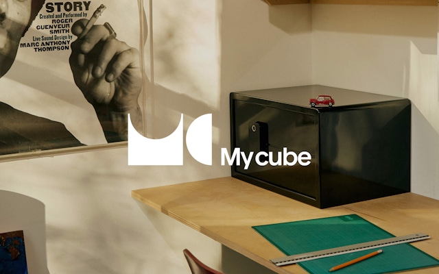


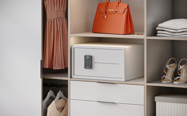
Renders created by My Cube


Appealing to a New Consumer
Mycube was founded as a modern incarnation of a 100-year-old family business in NYC. Leveraging its generational experience in lock-and-key security and vault making, Mycube launched with a focus on contemporary home safes. At the same time, ongoing reurbanization was resulting in smaller living spaces and functional layouts featuring more amenities ©. Less personal space also seemed to dovetail with heightened consumer interest in interior design. For Mycube, this consideration reframed the question of a safe’s purpose in the modern urban home and became very important as the company aimed to decrease its reliance on wholesalers. To do that, it needed to increase its D2C sales by reaching a younger urban demographic. Mycube hired Combo for the strategy-driven rebrand.
Refreshing the Traditional Category Messaging
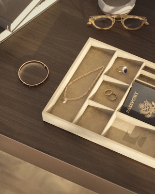
The strategy team recognized that to appeal to urban millennials, Mycube needed to stand for more than traditional security. Beyond a purely utilitarian appliance, a safe needed to respond directly to the needs and interests of this integral and growing consumer base. The team focused on identifying a new role safes could play in people’s lives and landed on a key insight: when a person needs a safe, it’s because they have reached a phase in their life that requires a higher level of responsibility, and therefore, organization. The brand identity, then, shifted away from security against theft and disaster—the largely fear-based messaging of the category—and toward valuing life’s most important things by having a well-designed and designated space for them.
New Visual Identity
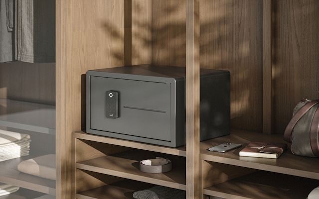
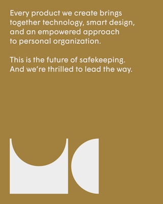
To create a visual identity that resonated with younger city dwellers, Combo’s design team leaned into a new brand world of interior design and minimalist home decor. The logo was built around the idea of things fitting in the right place, with the “M” and “C” nesting together for a visually rewarding gesture. The color palette reflected modernity and minimalism, steering away from competitors’ masculine branding and their emphasis on toughness and protection. Aligning with the brand’s new messaging for modern adulthood, Combo designers defined a photographic point of view that presented Mycube’s smaller, tech-enabled products in the same vein as beautiful furniture and design objects, showcasing the safes integrated into the decor of the living space instead of hidden in the back of the closet.
In essence, tidying ought to be the act of restoring balance among people, their possessions and the house they live in.
Website and Product Design
Previously, Mycube had only been selling through retailers. Combo helped them break out of the wholesale model by transforming their website into a digital commerce platform where they could sell directly to customers. The design team directed asset creation for the site, performing renders of product images and merging with photography. Additionally, Combo consulted on product design, ensuring that the products were a reflection of the brand: less a piece of technology and more a piece of design embedded with technology. The new visual system was now infused throughout the entire customer experience, from the website to the product to the integration of Mycube into the home.
The way it goes about securing valuables, however, extends way beyond any basic lockbox.
New business: Connect with a partner.
Job inquires: View our handbook.
Newsletter©: Sign up.
Combo
76 Bowery, 3rd Floor
NYC, 10013
Social Media
Instagram, LinkedIn
View our show reel:
Watch video
General inquiries:
hello@combo.co
Media inquires:
press@combo.co