

Finding a Competitive Edge in the Real Estate Market
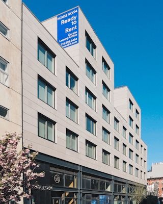
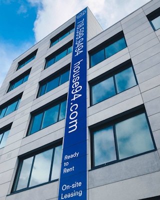
Since the rezoning of the North Brooklyn waterfront, housing development in Williamsburg has been a competitive market. In recent years, the steady influx of young, upwardly mobile professionals to the area encouraged a major uptick in the speed of new developments. This hypercompetitive landscape presented a challenge for Hudson Inc., a leading NYC housing development firm, as it was looking to launch a unique living experience that would set itself apart from the norm ©.
Strategy to Attract Members, Not Tenants
Combo strategists worked with the insight that the boutique building’s unique value proposition could be about forefronting its connection with the neighborhood. Additionally, its generous indoor-to-outdoor space ratio offered an elevated yet homey atmosphere. The strategy, then, was to create an apartment building with a clubhouse feel, with members instead of tenants. To do this, the brand identity, design and behaviors would focus on communicating how the building was embedded in the lifestyle of the surrounding community, distinguishing itself from its supersized competitors on the waterfront.
I live in Brooklyn, Williamsburg, so I just like to wander around. Williamsburg's such a cool little neighborhood community spot.
Naming and Logo Creation
The team landed on the idea of calling the development a house instead of an apartment building. Using the street address number gave the sense of physical location, situating it in the middle of the active neighborhood. The House No. 94 logo used numerical forms that doubled as shapes to express the indoor-outdoor features, using an iconographic style that expanded into other graphic elements.
Iconography and Visual System
Design deliverables included various signage, door numbers and a variety of sales materials. The full visual system took inspiration from members-only club references and included iconography reminiscent of badges to suggest the feel of a club. At the same time, design work included a comprehensive map of Williamsburg that visually connected House No. 94 to the rest of the neighborhood, communicating that the brand embodied a more comprehensive living community that extended past the front doors and into the community.
Brand-Aligned Amenities and Programs
In addition to design, the Combo team identified House No. 94 brand behaviors that could translate into tangible amenities for its members. Since the brand identity was just as focused on a communal living environment as it was on the individual housing units, Combo helped create “neighborly” amenities and programs such as an umbrella share, a bike share and a reusable grocery bag share that further instilled the community-centered philosophy of a shared home within a shared neighborhood.
House No. 94 is a unique community of its own within the heart of Williamsburg.
New business: Connect with a partner.
Job inquires: View our handbook.
Newsletter©: Sign up.
Combo
76 Bowery, 3rd Floor
NYC, 10013
Social Media
Instagram, LinkedIn
View our show reel:
Watch video
General inquiries:
hello@combo.co
Media inquires:
press@combo.co