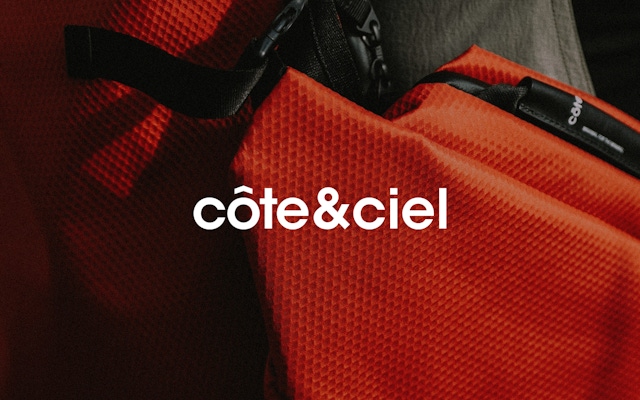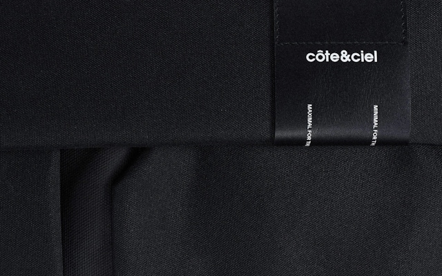


Photography produced by Côte&Ciel

From Core Product to Brand Direction
Côte&Ciel is a Parisian brand that grew out of one designer’s project to create a bag that met her husband’s dual needs as a creative director and a runner, equally fit to hold a laptop and running shoes. Informed by the founder’s background in industrial design, the line of products expanded over the next decade to include a variety of pieces. While most of the products gestured back to the original ideas of duality, movement and transition from one space to another, Combo was brought on board to help côte&ciel land a clearer articulation of its brand identity.
Defining the Guiding Principle of the Brand
Rather than operate simply as a bag-making company, côte&ciel wanted to define a North Star that could help them make decisions in the future. The Combo team helped identify directionality as a guiding principle of the brand and visual identity. Inspired by the origin story, the côte&ciel brand became about creating for people who are on the move. No matter where someone was going, they were in motion as they found their way from point A to point B.
Developing a Graphic Language
Combo designers explored a global navigational aesthetic to apply the idea of directionality across brand expressions. The compass influenced logo marks and typographic language, with visual iconography influenced by time zones and longitudinal/latitudinal coordinates—a nod to multihyphenate creatives guiding themselves through their day, their career and their travels.
Whether it’s for work or travel, our bags have a huge responsibility: they’re tasked with protecting our most treasured items while we shuffle around the planet.
Photographic and Filmic Point of View
The design team also provided direction for a brand photographic and filmic point of view. Again, following the North Star of directionality and wayfinding, brand images were to capture an individual on the move, heading toward a destination, with their côte&ciel bag functioning as an indispensable tool to help them on their journey.
A Triumph of Futuristic Functionality.
New business: Connect with a partner.
Job inquires: View our handbook.
Newsletter©: Sign up.
Combo
76 Bowery, 3rd Floor
NYC, 10013
Social Media
Instagram, LinkedIn
View our show reel:
Watch video
General inquiries:
hello@combo.co
Media inquires:
press@combo.co