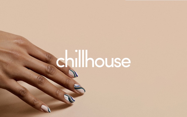


Photography and films produced by Chillhouse

Multifunctional Relaxation Space for City Living
Recent years have seen steady growth in urban centers of the young professional class. This increasing population of recent graduates, entrepreneurs and new business owners has expanded the consumer base for services that respond to the everyday stressors of a fast-paced, work-centered environment ©. While NYC already had a large number of spas ranging from high-end to no-frills, Chillhouse wanted to create a new kind of “accessible luxury” experience that catered to urban millennials. To appeal to this demographic, the company set out to combine a cafe, a nail salon and a massage parlor into one space that could serve as a center for relaxation.
Identifying an Unrecognized Audience
Through research on millennials and urbanization, Combo found that there was no spa specifically catering to Chillhouse’s target demographic. The team helped refine a business model that combined multiple layers of relaxation into a novel format—a singular space where young urbanites could gather and select from a broad menu of modalities for self-care, grooming and pampering. The cafe level housed a casual-social area for customers to unwind over matcha, teas, coffee and elixirs, while the nail salon and, further, the massage parlor levels offered increasingly more immersive personal care services. The brand strategy, then, positioned Chillhouse as a multidimensional relaxation hub that, rather than relying on category tropes of nature and serenity, leaned into excitement. The Chillhouse brand was about bringing a new energy to relaxation.
Millennials will be the core spa-going generation for years to come.
Visual Identity Based on Multidimensionality
Leaning into the different facets of relaxation, the Combo design team put together several different logos and a wide color palette of vibrant pastels. The logos were an exercise in variety, using that core principle to create a visual system rather than using a singular logo. The color palette was put together to anchor the visual identity in this new energy of relaxation, as opposed to the more traditional earth tones and “calming” photographic cliches of the spa category. The muted pastels signaled vibrancy, while the glowy photography style gestured toward the idea of auras and visual manifestations of moods and sensations.
Development of Retail and Online Experience
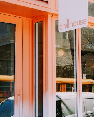
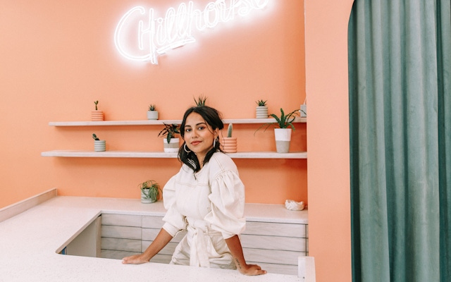
Combo provided retail consulting for Chillhouse’s flagship space, such as the architecture style and mood-defining details to reflect the brand. A lot of curved lines were brought into the architectural framework to infuse the place with a general softness. These shapes were paired with colors from the visual system that incorporated symbolism from aura readings and other energetic modalities to create an approachable atmosphere for guests. Combo also worked on Chillhouse’s web design and e-commerce platform, ensuring consistency across all expressions of the brand.
Product and Package Design
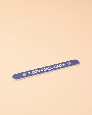
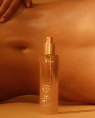
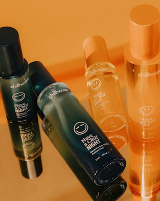
In addition to relaxation services, Chillhouse solicited Combo’s help in building out its product line and designing packaging. Combo designers created unique identities for each product, again leveraging variety as a core brand principle rather than consistency—creating a product line as varied as the relaxation services offered. The bright, energetic package designs expressed the brand personality and translated the in-person experience into the packaged products that customers could take with them or have sent to their homes.
A sort of choose your own wellness adventure.
New business: Connect with a partner.
Job inquires: View our handbook.
Newsletter©: Sign up.
Combo
76 Bowery, 3rd Floor
NYC, 10013
Social Media
Instagram, Behance, LinkedIn
View our show reel:
Watch video
General inquiries:
hello@combo.co
Media inquires:
press@combo.co